

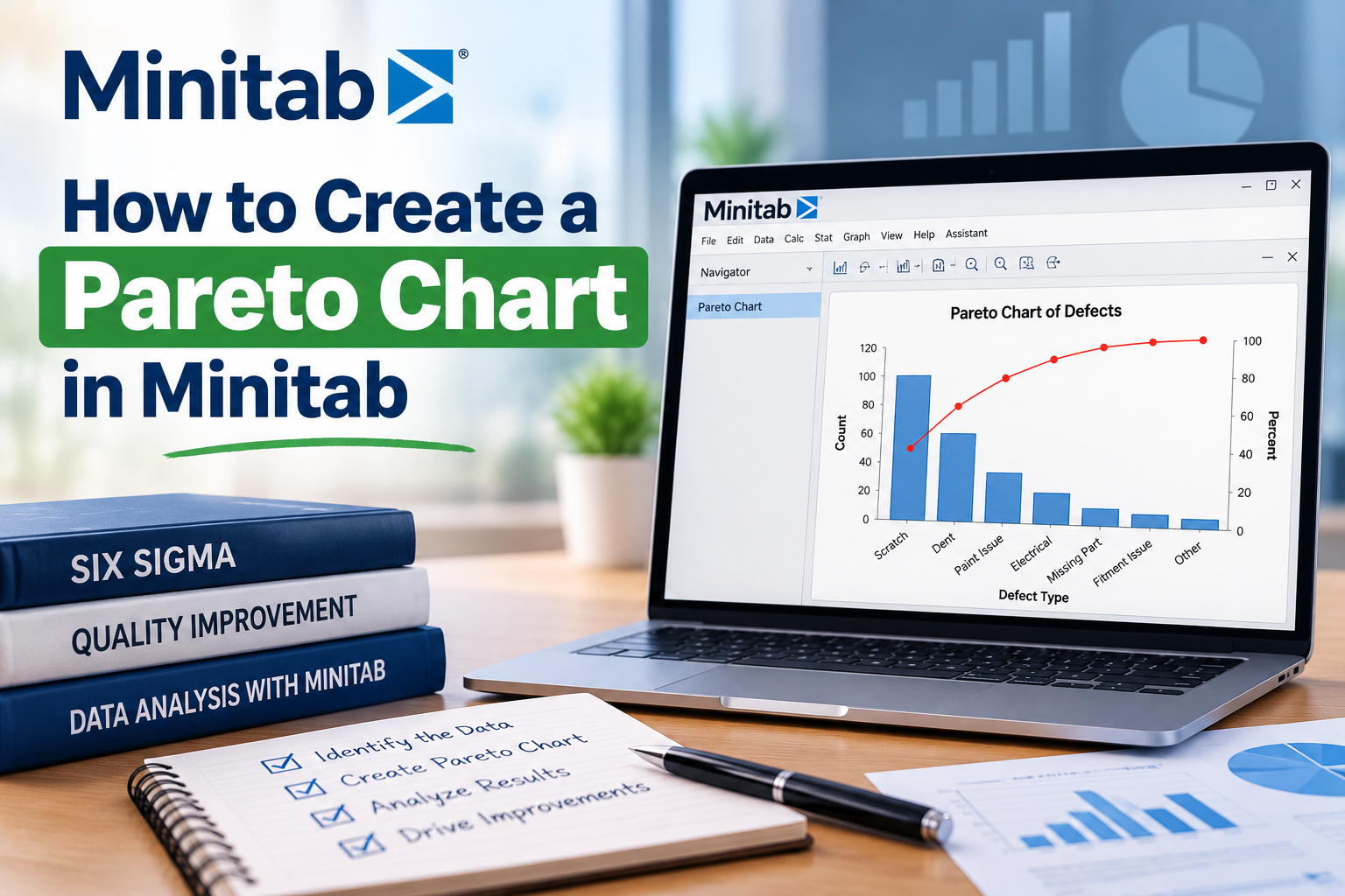

Are you looking to streamline your data analysis and identify the most significant factors affecting your business? A pareto chart in Minitab might just be what you need. This powerful tool helps you visualize and prioritize problems or opportunities, making it easier to focus your efforts where they matter most. In this guide, we'll walk you through the step-by-step process of creating a Pareto Chart using Minitab. We'll also delve into its importance, applications, and answer some frequently asked questions to ensure you can leverage this tool effectively.
What is a Pareto Chart?
A Pareto Chart is a bar graph that represents the frequency or impact of problems in a descending order. Named after the Italian economist Vilfredo Pareto, who observed that 80% of effects come from 20% of the causes, this chart is a visual representation of the vital few versus the trivial many. By identifying the most significant issues, businesses can allocate resources more efficiently, leading to improved performance and higher customer satisfaction.
Why Use Minitab for Creating a Pareto Chart?
Minitab is a powerful statistical software widely used in India and globally for data analysis. Its user-friendly interface and robust features make it ideal for creating a pareto chart in Minitab. Whether you are a beginner or an experienced analyst, Minitab simplifies the process, allowing for a more efficient analysis of your data.
Step-by-Step Guide to Creating a Pareto Chart in Minitab
Step 1: Prepare Your Data
The first step in creating a Pareto Chart is to gather and organize your data. You will need to enter your data into Minitab in a way that reflects the issues you want to analyze. Typically, this involves having two columns: one for the categories (e.g., types of defects) and another for the frequency or counts of those categories (e.g., number of defects).
Step 2: Enter Your Data into Minitab
Open Minitab and follow these steps to enter your data:
Step 3: Create the Pareto Chart
Now that your data is ready, let’s create the Pareto Chart:
Step 4: Customize Your Pareto Chart
After generating the chart, you may want to customize it to make it more informative and visually appealing:
Interpreting Your Pareto Chart
Once you have created your Pareto Chart, it’s essential to understand how to interpret it:
Applications of Pareto Charts in Business
Pareto Charts are incredibly versatile and can be applied in various business contexts:
Frequently Asked Questions (FAQs)
1. What is the difference between a Pareto Chart and a histogram?
A Pareto Chart displays individual categories in descending order of frequency, while a histogram shows the distribution of numerical data over a continuous interval. Pareto Charts help prioritize issues, whereas histograms help understand data distribution.
2. Can I create a Pareto Chart in Minitab with multiple categories?
Yes, Minitab allows you to create a Pareto Chart with as many categories as needed. Just ensure your data is organized correctly in the software.
3. What types of data are best suited for a Pareto Chart?
Pareto Charts are ideal for categorical data, such as types of defects, customer complaints, or sales figures. They are effective when you want to prioritize issues based on frequency or impact.
Conclusion
Creating a pareto chart in Minitab is a straightforward process that can significantly enhance your data analysis capabilities. By identifying the most critical issues affecting your business, you can make informed decisions, allocate resources effectively, and drive improvements. Whether you are in manufacturing, service, or any other industry, implementing Pareto Charts can lead to more efficient operations and higher customer satisfaction.
Call to Action
Ready to optimize your data analysis? Start using Minitab today to create your first Pareto Chart and unlock the potential of your data. Don’t let valuable insights slip through the cracks – take action and focus on what truly matters to your business!