



Data visualization is crucial in today's data-driven world, especially for professionals and students in India who are often required to analyze and present data effectively. One of the most powerful tools for visualizing relationships in data is the scatter plot in Excel. This blog will guide you step-by-step on how to create a scatter plot using Excel, including tips and tricks to enhance your data representation. Whether you're a beginner or looking to refine your skills, this guide has something for everyone.
What is a Scatter Plot?
A scatter plot is a type of graph that displays values for typically two variables for a set of data. The data points are plotted on the horizontal and vertical axes, allowing you to see how the variables relate to each other. This is particularly useful for identifying trends, clusters, and correlations in your data.
Why Use a Scatter Plot?
Using a scatter plot in Excel has several benefits:
Preparing Your Data
Before creating a scatter plot, ensure your data is well-structured. Here’s how to prepare your data for a scatter plot in Excel:
Creating a Scatter Plot in Excel
Now that your data is ready, let's create a scatter plot:
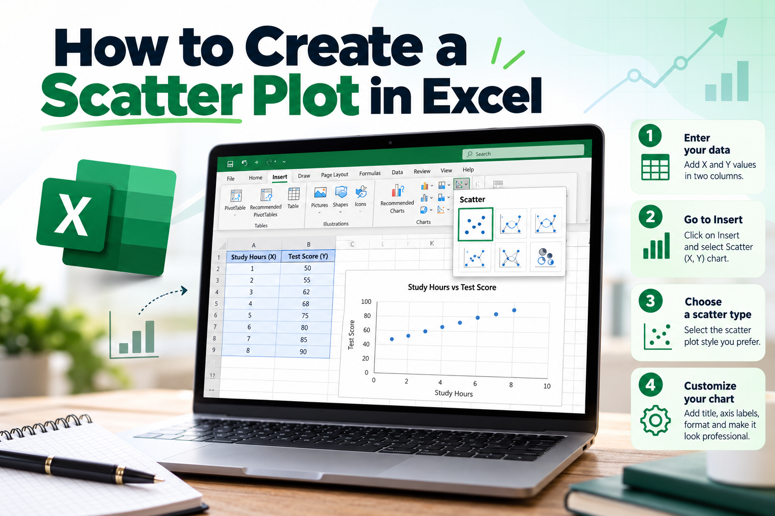
Step 1: Select Your Data
Highlight the two columns of data you want to plot. Make sure to include the headers as well, as Excel will use these for labeling.
Step 2: Insert Scatter Plot
1. Go to the Insert tab on the Ribbon.
2. In the Charts group, click on the Scatter icon.
3. Choose the type of scatter plot you prefer (e.g., Scatter with only Markers).
Step 3: Customize Your Scatter Plot
Once your scatter plot appears, you can customize it to make it more informative and visually appealing:
Analyzing Your Scatter Plot
After creating your scatter plot in Excel, it's time to analyze what the data is telling you. Look for patterns, such as:
Common Mistakes to Avoid
When creating a scatter plot, avoid these common pitfalls:
FAQs
1. How do I save my scatter plot in Excel?
To save your scatter plot, simply save your Excel workbook as you normally would. The chart will be saved along with the data.
2. Can I change the color of the data points in my scatter plot?
Yes, right-click on any data point in the scatter plot, select "Format Data Series," and choose your desired color.
3. Is it possible to create a scatter plot with more than two variables?
While a typical scatter plot represents two variables, you can use different colors or shapes for data points to represent additional variables.
4. How can I add data labels to my scatter plot?
Right-click on a data point, select "Add Data Labels," and then customize them as needed for clarity.
5. What should I do if my scatter plot looks cluttered?
If your scatter plot appears cluttered, consider filtering your data or using a different visualization method, such as a bubble chart.
Conclusion
Creating a scatter plot in Excel is a straightforward process that can significantly enhance your data analysis capabilities. By visualizing the relationships between variables, you can make more informed decisions and present your findings more effectively. Whether you're a student, researcher, or professional, mastering this skill is essential in today's data-centric environment.
Ready to dive deeper into data visualization? Start practicing today and transform how you analyze data. If you found this guide helpful, feel free to share it with your friends or colleagues who might benefit from creating scatter plots in Excel!
Call to Action: Want to learn more about Excel and data analysis? Subscribe to our newsletter for the latest tips, tricks, and tutorials tailored for the Indian audience!