
Latest Post

Quality Management Courses



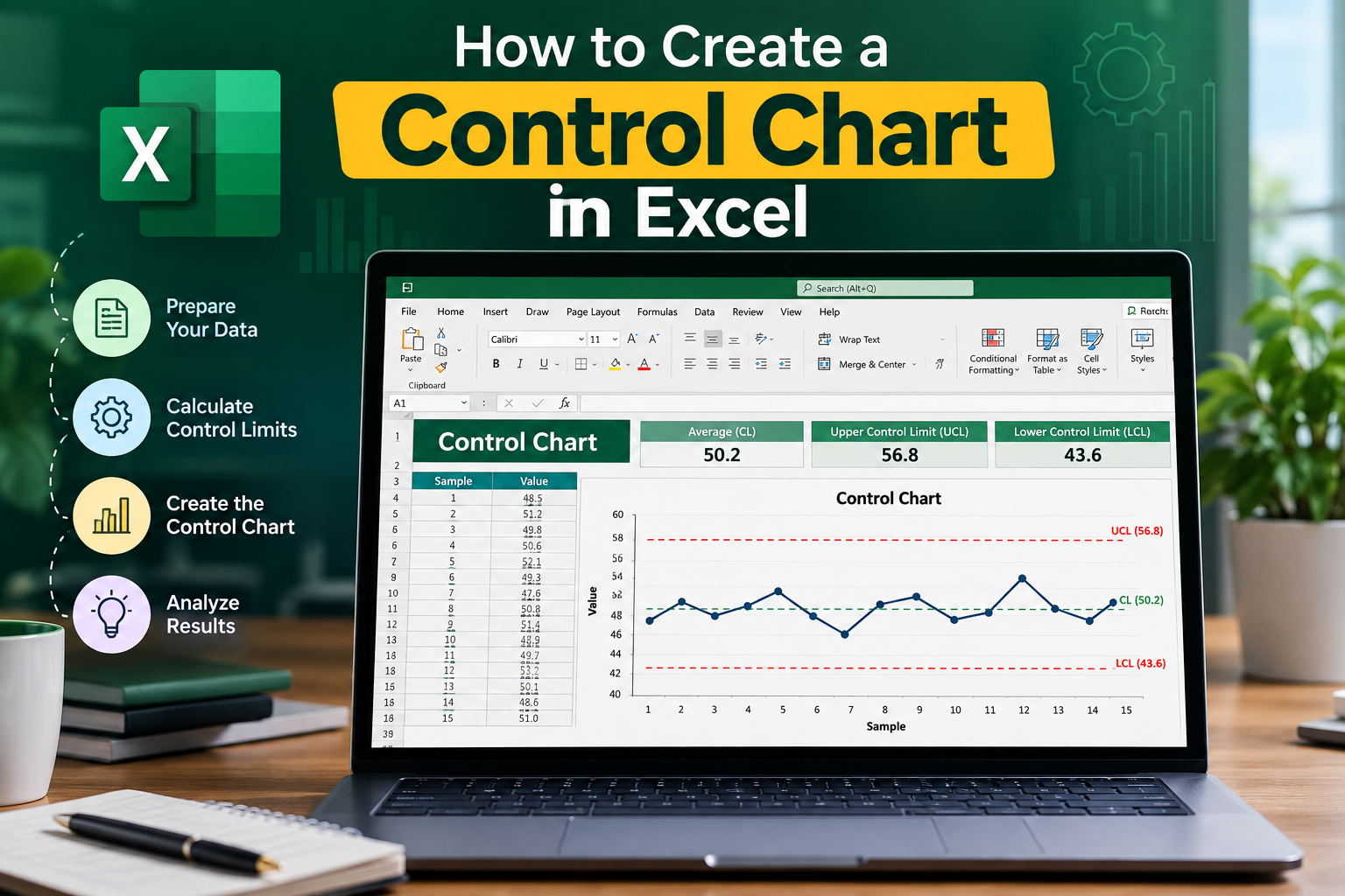

Control charts are essential tools used in quality management and process improvement. They help organizations monitor processes over time, identifying any variations that may indicate issues. If you’re looking to create a control chart in Excel, you’ve come to the right place! In this guide, we’ll walk you through the steps to create a control chart, tailored specifically for the Indian audience, ensuring that you can enhance your data analysis skills with practical applications.
What is a Control Chart?
A control chart is a statistical tool that helps you track the performance of a process over time. It displays data points in a time-ordered sequence and includes control limits, which define the acceptable range of variation. This allows you to visually assess whether a process is stable and predictable or if it requires intervention.
Types of Control Charts
In this guide, we will focus on creating an X-bar chart, which is one of the most commonly used control charts.
Why Use Excel for Control Charts?
Microsoft Excel is widely used in India and across the globe for data analysis and visualization. It offers a user-friendly interface and powerful features that make creating a control chart in Excel efficient and straightforward. Additionally, many professionals are already familiar with Excel, which reduces the learning curve associated with new software tools.
Steps to Create a Control Chart in Excel
Now that you understand the basics of control charts, let’s dive into the step-by-step process of creating a control chart in Excel.
Step 1: Gather Your Data
The first step in creating a control chart is to collect the relevant data. You should have measurements from your process over time. For example, if you are tracking the weight of a product produced in a factory, gather data for a specific period.
Step 2: Organize Your Data
Input your data into Excel in a structured format. Here’s an example layout:
Step 3: Calculate the Mean and Range
Next, calculate the mean (X-bar) and range (R) for your data. You can do this using Excel formulas:
Step 4: Determine Control Limits
Control limits are crucial for your control chart. For an X-bar chart, the control limits can be calculated using the following formulas:
The value of A2 depends on the sample size. You can refer to control chart constant tables to find the appropriate value.
Step 5: Create the Control Chart
With your data and calculated limits, it’s time to create the control chart:
Step 6: Analyze the Chart
Once your control chart is ready, analyze it to identify any trends or variations. Look for points that fall outside the control limits or patterns indicating an unstable process. This analysis will guide you in making informed decisions to improve your process.
Best Practices for Control Charts in Excel
When creating a control chart in Excel, consider the following best practices:
Common Mistakes to Avoid
Creating a control chart can be simple, but avoiding common mistakes is crucial:
FAQs About Control Charts in Excel
1. What is the purpose of a control chart?
The primary purpose of a control chart is to monitor the stability of a process over time, helping identify any variations that may require corrective action.
2. Can I create different types of control charts in Excel?
Yes, Excel allows you to create various types of control charts, including X-bar, R, P, and C charts. The process is similar for each type, but the calculations for control limits may differ.
3. How often should I update my control chart?
It’s best to update your control chart regularly, depending on the frequency of data collection. Daily, weekly, or monthly updates may be necessary to keep track of process performance.
4. Is Excel the best tool for creating control charts?
Excel is a popular choice for creating control charts due to its accessibility and ease of use. However, specialized statistical software may offer more advanced features for complex analysis.
5. How can I interpret the results of my control chart?
Evaluate the data points against the control limits. Points outside these limits may indicate a need for process improvement, while a stable pattern within the limits suggests the process is in control.
Conclusion
Creating a control chart in Excel is an invaluable skill for professionals looking to enhance their quality management processes. By following this guide, you can easily create and analyze control charts that provide insights into your processes. Remember, the key to successful implementation lies in consistent data collection, regular updates, and effective analysis.
If you found this guide helpful, consider sharing it with your colleagues or exploring more resources on quality management. Want to dive deeper into data analysis? Contact us today for expert training and consultancy services!