
Latest Post


Quality Management Courses



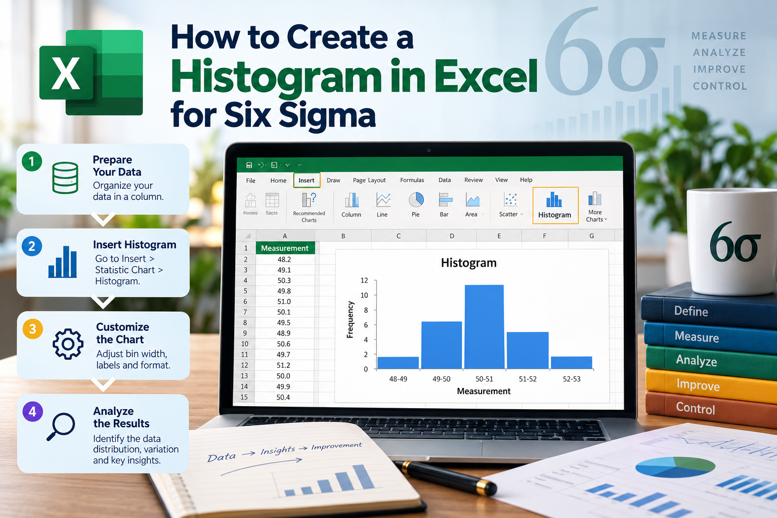

In the world of quality management and process improvement, Six Sigma has emerged as a powerful methodology. One of the essential tools in the Six Sigma toolkit is the histogram, a graphical representation that helps in understanding the distribution of data points. If you're in India and want to learn how to create a histogram in Excel for Six Sigma, you've come to the right place. This guide will walk you through the steps, tips, and best practices to create effective histograms using Excel.
Understanding Histograms and Their Importance in Six Sigma
A histogram is a type of bar chart that displays the frequency distribution of a dataset. In Six Sigma, histograms are crucial for identifying variations and patterns in data, which can help in decision-making processes. By visualizing data, teams can quickly assess whether a process is stable or if improvements are necessary.
Histograms allow Six Sigma practitioners to:
Step-by-Step Guide to Creating a Histogram in Excel for Six Sigma
Step 1: Prepare Your Data
The first step in creating a histogram in Excel for Six Sigma is to prepare your data. Ensure that your dataset is organized, with one column representing the different data points you want to analyze. For example, if you are analyzing customer wait times, create a column titled "Wait Times" and enter your data points accordingly.
Step 2: Define the Bin Range
Bins are intervals that group your data points. To create a histogram effectively, you must define the bin range. For instance, if your wait times range from 0 to 30 minutes, you might define bins as follows:
Create a new column in your Excel sheet and label it "Bins," then input the upper limit of each bin.
Step 3: Insert a Histogram Chart
With your data and bins prepared, it's time to create the histogram:
Your histogram will now be displayed on the Excel sheet. You can customize the chart as needed to fit your presentation style.
Step 4: Customize Your Histogram
To make your histogram more informative and visually appealing, consider customizing it:
Step 5: Analyze the Histogram
Once your histogram is complete, it's time to analyze it. Look for patterns, such as:
These analyses will guide your Six Sigma initiatives and help you make informed decisions.
Best Practices for Creating Histograms in Excel for Six Sigma
To ensure that your histograms are effective and useful, keep these best practices in mind:
FAQs About Creating a Histogram in Excel for Six Sigma
1. What is the role of histograms in Six Sigma?
Histograms help visualize data distributions, identify patterns, and understand variability, enabling informed decision-making in process improvement initiatives.
2. Can I create a histogram in older versions of Excel?
Yes, while the steps may differ slightly, you can create histograms in older versions of Excel by using the Data Analysis Toolpak or manually creating a bar chart.
3. How do I interpret my histogram data?
Analyze the shape of the histogram, check for normality, identify outliers, and understand the distribution of your data to derive insights for process improvements.
4. What should I do if my data has gaps or empty bins?
Consider adjusting your bin sizes or analyzing the data to understand why certain ranges have no data. This may indicate areas for further investigation.
5. Is there a way to automate histogram creation in Excel?
Yes, you can use Excel macros or VBA scripts to automate the creation of histograms, which can save time and ensure consistency in your analyses.
Call to Action
Creating a histogram in Excel for Six Sigma is a valuable skill that can enhance your data analysis capabilities. By following the steps outlined in this guide, you'll be well on your way to mastering this essential tool. If you found this article helpful, please share it with your colleagues and friends. For more tips on Six Sigma and data analysis, subscribe to our newsletter!