
Latest Post


Quality Management Courses



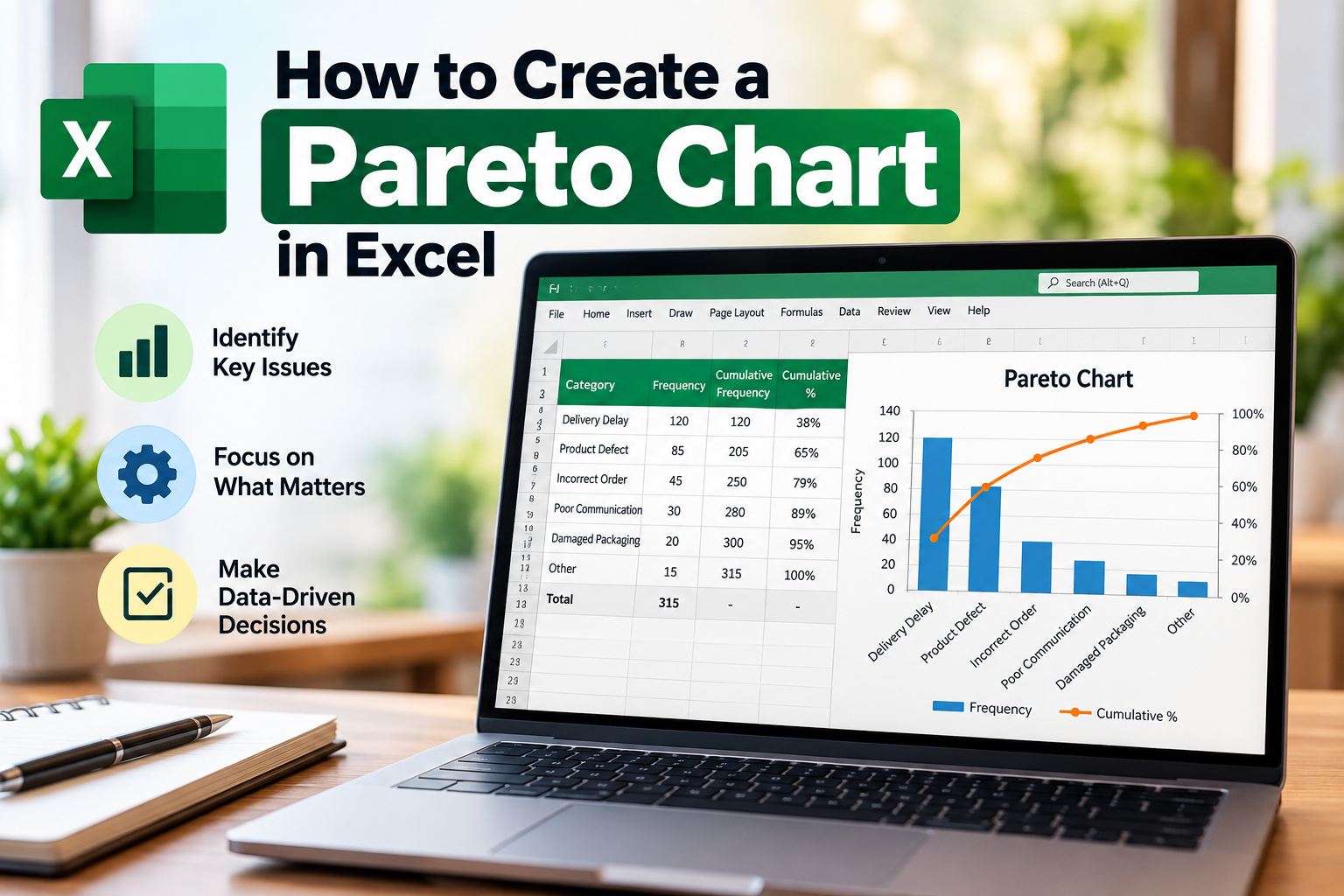

Are you looking to identify the most significant factors affecting your business's performance? A Pareto chart in Excel can be your best ally. This powerful tool not only helps visualize data but also assists in making informed decisions. In this comprehensive guide, we will delve into the steps to create an effective Pareto chart in Excel, ensuring that you can harness its potential for your business's growth. Whether you're an entrepreneur, a student, or a professional analyst, understanding how to create a Pareto chart is invaluable.
What is a Pareto Chart?
A Pareto chart is a type of bar graph that represents the frequency of problems or causes in descending order alongside a cumulative line graph. Named after the Italian economist Vilfredo Pareto, this chart is based on the Pareto Principle, which states that 80% of effects come from 20% of the causes. This visualization is crucial for prioritizing issues and identifying where to focus your efforts for maximum impact.
Why Use a Pareto Chart in Excel?
Excel is one of the most widely used tools for data analysis, and creating a Pareto chart in Excel has numerous advantages:
Steps to Create a Pareto Chart in Excel
Step 1: Gather Your Data
Before you can create a Pareto chart in Excel, you need to collect relevant data. This data should represent the categories you want to analyze, along with their corresponding values. For instance, if you're assessing customer complaints, you might compile data on the types of complaints and the number received.
Step 2: Organize Your Data
Once you have your data, organize it in a table format. For example:
Step 3: Sort Your Data
Next, sort your data in descending order based on the values. This sorting is crucial as a Pareto chart displays the most significant issues first.
Step 4: Calculate Cumulative Percentages
To create a Pareto chart in Excel, you need to calculate cumulative percentages. To do this:
Your table should now look like this:
Step 5: Insert a Bar Chart
Now that your data is organized and sorted, it’s time to create the Pareto chart:
Step 6: Create the Cumulative Line
To add the cumulative percentage line:
Step 7: Format Your Chart
To enhance readability, format your Pareto chart in Excel:
Best Practices for Using a Pareto Chart in Excel
To maximize the benefits of your Pareto chart:
FAQs
1. Can I create a Pareto chart in Excel without prior experience?
Yes! This guide provides step-by-step instructions that even beginners can follow to create a Pareto chart in Excel.
2. Is Excel the best tool for creating Pareto charts?
While there are other tools available, Excel is one of the most accessible and widely used applications for creating Pareto charts, especially in India.
3. Can I customize the appearance of my Pareto chart?
Absolutely! Excel allows you to customize colors, labels, and chart types to make your Pareto chart visually appealing and informative.
4. How do I interpret my Pareto chart?
A Pareto chart displays the most significant issues on the left, allowing you to focus your efforts on the problems that contribute most to your overall results.
5. Is it possible to create a Pareto chart in Excel Mobile?
Creating a Pareto chart in Excel Mobile is limited. For more advanced features, it is advisable to use Excel on a desktop or laptop.
Conclusion
Creating a Pareto chart in Excel is a straightforward process that can yield powerful insights into your data. By following the steps outlined in this guide, you can effectively visualize and analyze the factors impacting your business or projects. Start applying this knowledge today to prioritize your efforts and drive meaningful changes in your organization.
Ready to get started with your Pareto chart? Download our free Excel template and simplify your data analysis today!