
Latest Post



Quality Management Courses



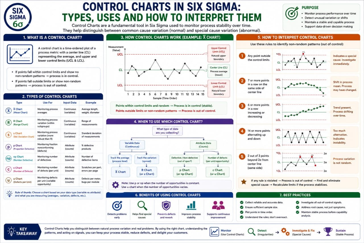

In the realm of quality management and process improvement, Six Sigma stands as a beacon of efficiency and excellence. One of the pivotal tools within Six Sigma is the control chart. Understanding how to use and interpret control charts is essential for professionals aiming to enhance their operational processes. This article delves into the various types of control charts, their uses, and how to interpret them effectively.
What are Control Charts?
Control charts are graphical tools used in statistical process control (SPC). They help monitor the stability of processes over time. By plotting data points over time against control limits, organizations can quickly identify variations in their processes. These variations can be classified into common cause variations (inherent to the process) and special cause variations (resulting from specific factors). Understanding these variations is crucial for maintaining quality standards.
Importance of Control Charts in Six Sigma
Control charts play a vital role in the Six Sigma methodology. They provide a visual representation of process behavior, allowing teams to:
Types of Control Charts
There are several types of control charts that cater to different data types and process characteristics. Below are some of the most commonly used control charts in Six Sigma:
1. X-bar and R Chart
The X-bar and R chart is used for monitoring the mean and range of a process based on subgroups. It’s particularly useful when dealing with variable data collected in small samples. The X-bar chart tracks the average of the samples, while the R chart monitors the variability within those samples.
2. X-bar and S Chart
Similar to the X-bar and R chart, the X-bar and S chart is used for variable data but focuses on the standard deviation of the samples instead of the range. This chart is suitable for larger sample sizes and provides a more precise measure of variability.
3. P Chart
P charts are utilized for monitoring the proportion of defective items in a process. This control chart is applicable when the data is categorical, such as pass/fail or yes/no outcomes. It helps organizations maintain acceptable quality levels by tracking defect rates over time.
4. NP Chart
NP charts are similar to P charts but focus on the count of defective items instead of the proportion. This chart is ideal for processes where the sample size remains constant, making it easier to visualize trends in defect counts.
5. C Chart
The C chart is used to monitor the count of defects in a process where the sample size can vary. It’s essential for processes that produce multiple defects per item, allowing teams to understand the defect density over time.
6. U Chart
U charts are similar to C charts but account for varying sample sizes. This makes them useful for processes where the opportunity for defects changes, as they provide a more accurate representation of defect rates relative to the size of the process.
How to Use Control Charts
Implementing control charts in your Six Sigma initiatives involves several steps:
1. Define the Process
Identify the process you want to monitor. Clearly outlining the process flow will help you determine the critical points where data should be collected.
2. Collect Data
Gather data relevant to the process. Ensure that the data is accurate, timely, and representative of the process conditions.
3. Choose the Right Control Chart
Select an appropriate control chart based on the type of data collected. The choice between variable and attribute charts will depend on your specific needs.
4. Calculate Control Limits
Control limits are calculated using the data collected. These limits should typically be set at three standard deviations from the process mean, which helps in identifying variations.
5. Plot the Data
As data points are collected over time, plot them on the control chart. This visual representation will help you identify trends and variations in real-time.
6. Interpret the Chart
Analyze the chart for signs of special cause variations or trends. If points fall outside of control limits or show an unusual pattern, further investigation is required to identify and address the underlying issues.
Interpreting Control Charts
Interpreting control charts is an essential skill for Six Sigma practitioners. Here are some key points to consider when analyzing a control chart:
1. Look for Out-of-Control Points
Any data points that fall outside the control limits are considered out-of-control points. These indicate that a special cause variation may be present and warrants further investigation.
2. Identify Trends
Look for systematic patterns in the data points. A consistent upward or downward trend suggests that the process may be drifting and requires corrective action.
3. Check for Cycles or Clusters
Clusters of points or repeating cycles can indicate underlying issues affecting the process. Identifying these patterns can help pinpoint areas for improvement.
4. Evaluate the Range of Variation
Assess the overall variability of the process by examining the spread of the data points. A tight clustering around the mean indicates a stable process, while a wide spread suggests instability.
Control Chart Examples
To further illustrate the use of control charts, let’s look at a couple of control chart examples:
Example 1: Manufacturing Defects
In a manufacturing setup, a team monitors the number of defects per batch using a P chart. Over several weeks, they plot the proportion of defective items. By analyzing the chart, they identify a spike in defects correlated with a specific machine's usage, prompting a maintenance check.
Example 2: Call Center Response Times
A call center tracks average response times using an X-bar chart. When the team notices an upward trend in response times, they investigate staffing levels and adjust schedules to address the issue before it impacts customer satisfaction.
Frequently Asked Questions (FAQs)
1. What is a control chart in Six Sigma?
A control chart in Six Sigma is a statistical tool used to monitor and control a process by plotting data points over time against predetermined control limits.
2. What are the main types of control charts?
The main types of control charts include X-bar and R charts, X-bar and S charts, P charts, NP charts, C charts, and U charts.
3. How do control charts help in process improvement?
Control charts help identify variations in processes, enabling teams to take corrective actions before issues escalate, thereby enhancing overall quality and efficiency.
4. Can I use control charts for attribute data?
Yes, control charts such as P charts and C charts are designed specifically for attribute data, allowing you to monitor proportions or counts of defects.
5. How often should I update my control charts?
Control charts should be updated regularly as new data becomes available. This ensures that the charts reflect the current state of the process and help in timely decision-making.
Conclusion
Control charts are an invaluable asset in the Six Sigma toolkit, providing insights into process stability and performance. By understanding the different types of control charts, their uses, and how to interpret them, organizations can drive continuous improvement and maintain high-quality standards.
Are you ready to implement control charts in your processes? Start leveraging the power of statistical process control today and watch your operational efficiency soar. For more insights and expert guidance, feel free to reach out to us!